'Fat Marker' Sketches: Why Low Fidelity Wins in Agile Teams
There is a paradox at the heart of professional design tools. The more polished and refined a design looks — the more it resembles finished software — the less useful it is for getting honest feedback and generating genuine collaboration. Polished mockups communicate finality. They signal to engineers that the design is decided and their job is to implement it. They signal to stakeholders that the design is so complete it can be evaluated aesthetically rather than strategically. And they signal to users in research sessions that this is a real product, which makes them reluctant to express confusion or suggest fundamental changes. High fidelity, paradoxically, reduces the quality of the information you get from it.
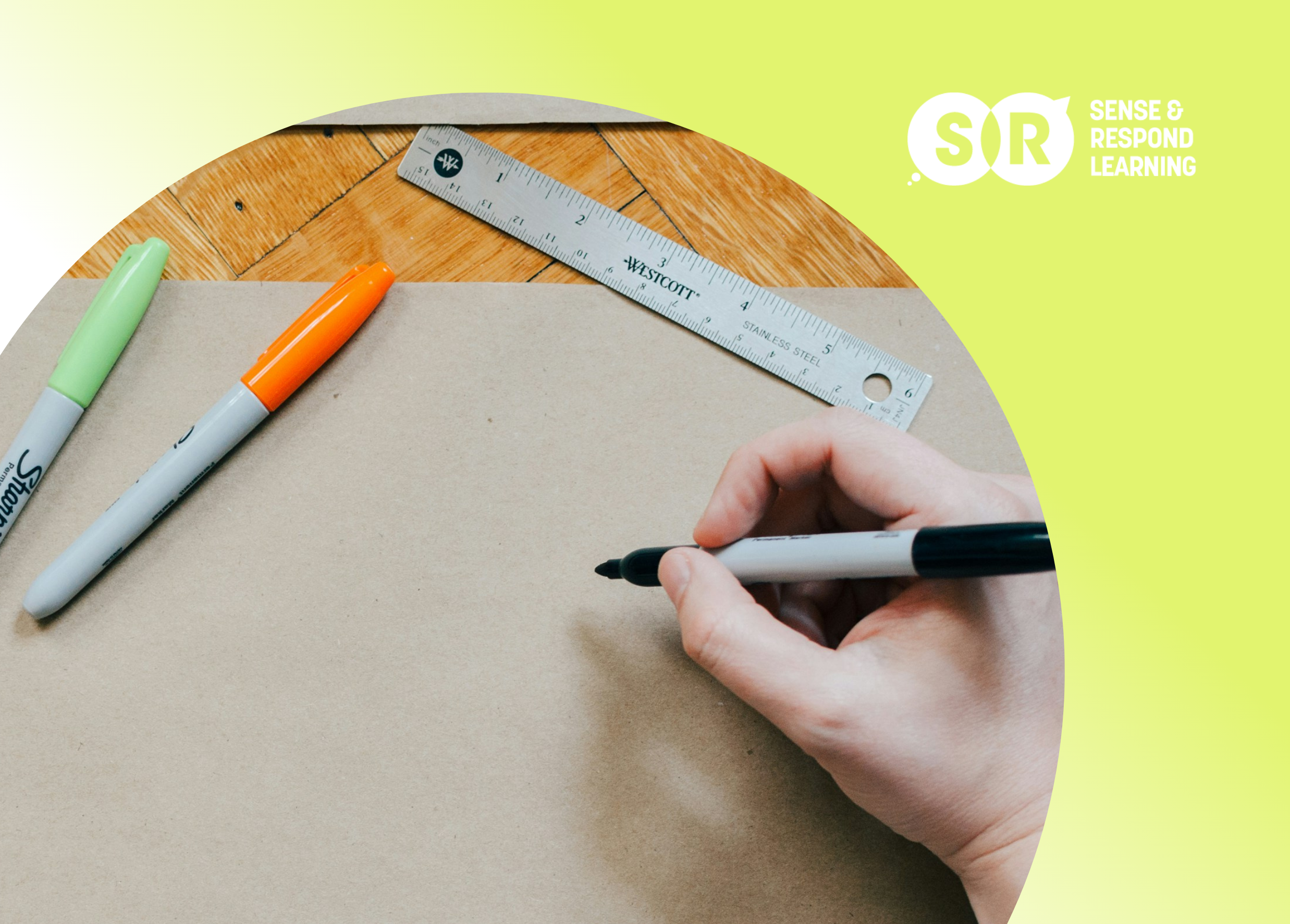
Fat marker sketches — rough, hand-drawn representations of interface concepts created with thick markers that prevent fine detail — are the deliberate antidote to this paradox. They look unfinished because they are unfinished. And that incompleteness is a feature, not a flaw. When a sketch looks rough, everyone in the room understands that decisions are still open. Engineers feel licensed to flag implementation concerns before committing to code. Stakeholders focus on whether the concept addresses the right problem rather than whether the button color is correct. Users in research sessions say what they actually think rather than softening criticism of something that looks expensive to have produced. Low fidelity earns honest engagement in a way that high fidelity rarely does.

A fat marker sketch communicates concept, not completion — and that ambiguity earns better feedback.
The Science Behind the Fat Marker
The choice of a thick marker over a fine-tip pen is not aesthetic — it is functional. A thick Sharpie makes it physically difficult to draw fine detail. You cannot render precise typography, pixel-accurate spacing, or detailed iconography with a marker that produces a line several millimeters wide. This physical constraint forces the sketcher to think at the level of concept and layout rather than the level of component and style. The result is a sketch that communicates 'this is the general idea of what this screen does and how its major elements are organized' rather than 'this is how the finished screen should look.' That conceptual level of communication is exactly what early-stage design conversations need.
In Lean UX collaborative design sessions, fat marker sketches serve as the medium for the diverge phase — the part of a Design Studio where the team generates as many different approaches as possible before converging on a direction. Because sketches can be produced in minutes rather than hours, teams can generate ten to fifteen distinct concepts in a single session. The volume matters: the best ideas rarely emerge first. They appear after the obvious approaches have been exhausted and participants are being pushed to think differently. High-fidelity tools create a selection pressure against volume because each iteration costs more time and effort. Fat markers remove that selection pressure and enable the creative abundance that precedes good convergence.
Using Sketches to Invite Engineering Input
One of the most valuable and underused applications of fat marker sketches is as a communication tool with engineers before design is finalized. When a designer shares a rough sketch with an engineer — something that took fifteen minutes to produce — and asks 'Does this approach raise any implementation flags?' they get a qualitatively different response than when they share a polished mockup. The sketch communicates that decisions are still open and the designer genuinely wants input. The engineer responds to a sketch as a collaborator contributing to an open question rather than as a critic evaluating a decision already made.
This dynamic changes what engineers share. When reviewing a polished design, engineers often filter their concerns: 'Is this worth pushing back on when the designer has clearly invested significant time here?' With a sketch, that filter disappears. Engineers will flag technical constraints, alternative approaches that might be simpler to implement, and interaction edge cases that the designer may not have considered — all of which is exactly the input the designer needs before finalizing the design. The result is a design that is more technically informed, arrives at implementation with fewer surprises, and requires fewer revision cycles after engineering begins. Rough sketches, shared early, save more time than they cost.
When everyone sketches with thick markers, volume of ideas replaces polish as the goal
When to Move from Sketches to Higher Fidelity
The discipline of staying in low fidelity is not an end in itself. It is a means to efficient learning. The signal to move from fat marker sketches to clickable prototypes or higher-fidelity mockups is when you have learned what you need to learn at the sketch level. Specifically: when the concept has been validated as worth pursuing (through team alignment or early user research), when the major structural decisions about layout and information hierarchy have been made, and when the questions you have remaining are about specific interaction details or visual refinement rather than fundamental approach. At that point, investing in higher fidelity is justified because the remaining questions genuinely require it.
A common mistake in agile design practice is treating fidelity increases as natural progress rather than deliberate decisions. Teams move from sketches to wireframes to mockups on a timeline rather than on an evidence basis. The question to ask at each fidelity transition is: 'What question am I trying to answer that this fidelity level will answer better than the previous one?' If the answer is clear — 'I need to test whether users can navigate the three-step flow without instruction, and they need a clickable prototype to simulate that navigation' — the increase is warranted. If the answer is vague — 'It feels like time to make this more detailed' — you are likely moving to higher fidelity before you have fully exploited what lower fidelity can teach you.
Building a Fat Marker Practice on Your Team
Introducing fat marker sketching as a team practice requires normalizing a degree of visual roughness that many designers find uncomfortable. Professional designers are trained to produce high-quality visual work, and sharing rough sketches can feel like a violation of that professional standard. The reframe that helps most: the quality standard for a fat marker sketch is conceptual clarity, not visual refinement. A sketch that clearly communicates a navigation model or information architecture decision, even if drawn with imperfect proportions and messy text labels, is a high-quality sketch for its purpose.
Start by introducing sketching in facilitated sessions — Design Studios or quick concept brainstorms — where everyone is sketching and no individual's sketch is singled out. The social context of collective sketching normalizes roughness and makes it easier for designers to share work they would not individually choose to show. As the practice becomes a team norm, designers begin to see the speed advantages of staying in sketch form longer, and the organic pressure to move to high fidelity prematurely diminishes. The goal is a team where 'Can we rough this out first?' is a standard reflex at the beginning of any design conversation, rather than an unusual request.
The Bottom Line
Low fidelity is a superpower that most design teams underuse because it requires trading apparent professionalism for actual speed and collaboration quality. Fat marker sketches are not a compromise — they are the right tool for the early stages of design, when the most important decisions are still open and the most valuable input comes from the honest reactions of collaborators who understand they are looking at an idea in progress, not a finished proposal. Build the habit of staying rough longer, and invest in fidelity only when the questions you are trying to answer genuinely require it.
Related Posts from Sense & Respond Learning
Facilitating a 'Design Studio': Getting Your Whole Team to Sketch Solutions
The Death of the Handoff: Why 'Over the Wall' Design Is Failing
The Truth Curve: How to Choose the Right MVP Fidelity for Your Idea
Facilitating Remote Design Sprints: Tools and Tactics for Distributed Teams
Further Reading & External Resources
Lean UX (3rd Edition) — Jeff Gothelf & Josh Seiden — The source methodology for collaborative sketching and fat marker design
Sketching User Experiences — Bill Buxton — The definitive book on why and how to sketch in the design process
UX Sketching — Nielsen Norman Group — Research-backed guidance on integrating sketching into UX workflows
Want to go deeper? This post is part of the Sense & Respond Learning resource library — practical frameworks for product managers, transformation leads and executives who want to lead with outcomes, not outputs.
Explore the full library at https://www.senseandrespond.co/blog